


Digital Maturity Year 1400 | Digital Yearbook 1400 The digital deadline of 1401 is a completely smart internet deadline and
Digital Maturity Year 1400 | Digital Yearbook 1400 The digital deadline of 1401 is a completely smart internet deadline and
Download and print the calendar of the year 1400 – Download the yearbook and maturity of the year 1400 pdf
Download calendar for Android phone
Download 1399 calendar for Android – Download phone calendar – Bad Saba calendar Android Calendar, Free Android Calendar, 99 Year
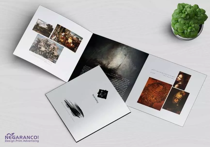
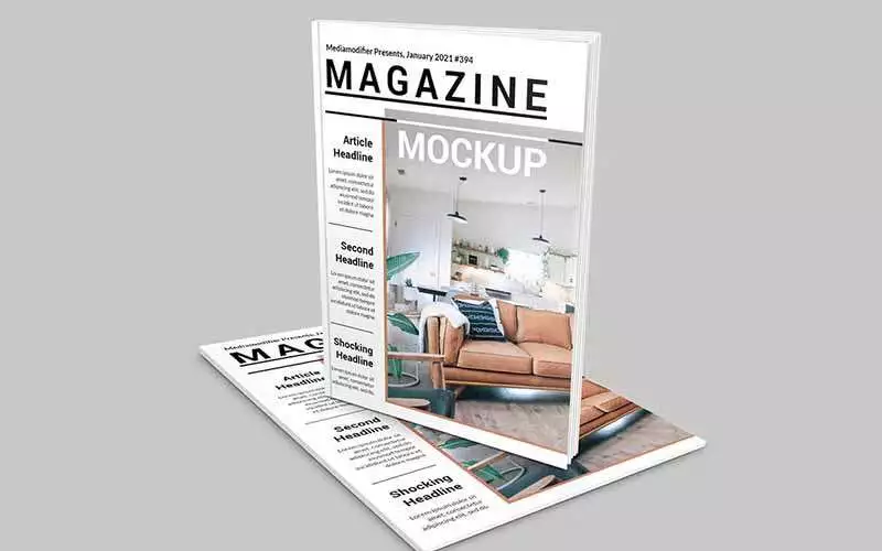
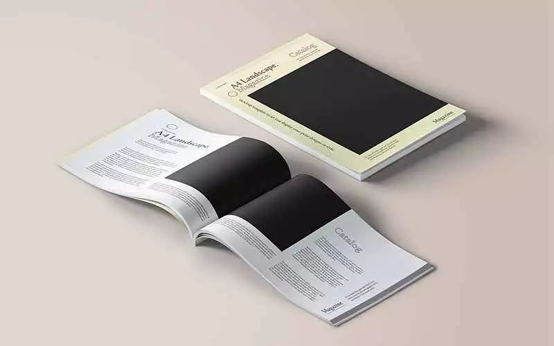
Digital Catalog Digital Magazine Smart Catalog Catalog of digital writers, online catalog or digital magazine or smart catalog of printing
Download and print the calendar of 1399 – Download the yearbook and maturity of 99 pdf To print the calendar

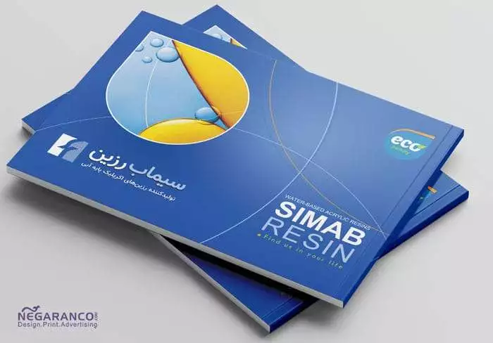
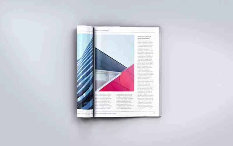
Online brochure design How to design a brochure Design price Online brochure design of the printing and advertising company, all
Download Calendar 1398 – Download Calendar 98 pdf To print all kinds of yearbooks, desktops, calendars, desktops, wallpapers or specials